Goldsmiths’ Fair
Held at the prestigious Goldsmiths Hall, Goldsmiths’ Fair is recognised internationally as the premier UK showcase for contemporary jewellery and silver.
The Fair had developed a dated image, visitor numbers were falling and exhibitors losing interest. We were asked to create a new identity to bring the Fair back to life. Our research showed that the Fair didn’t reflect the direction that the industry was headed and that a younger fashion and culture conscious audience needed to be attracted.
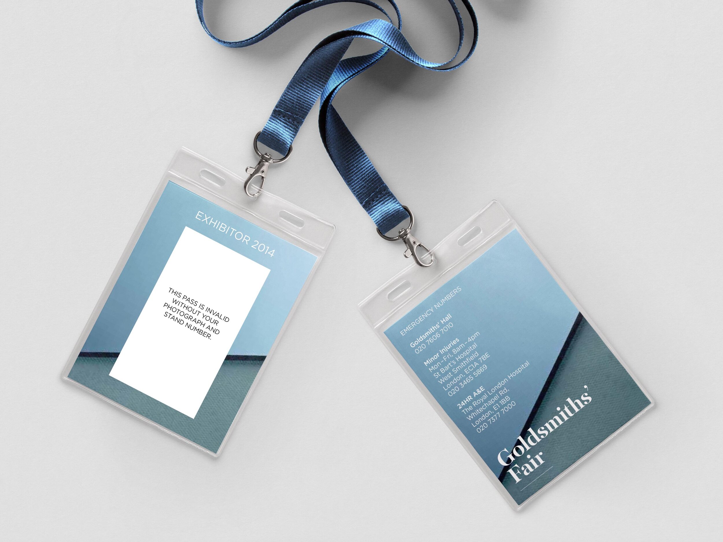
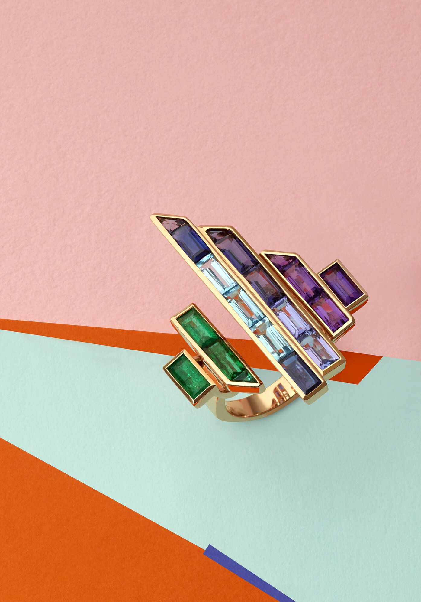
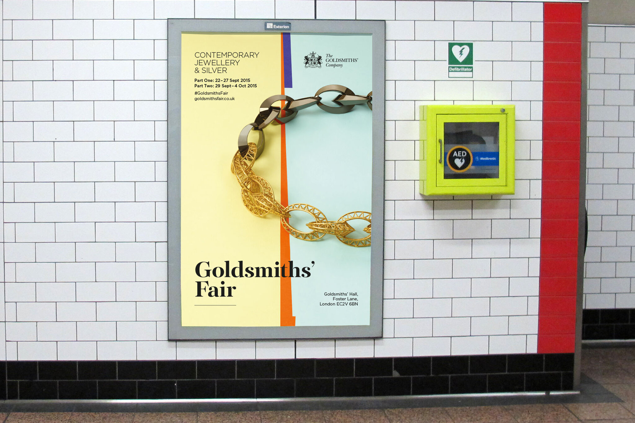
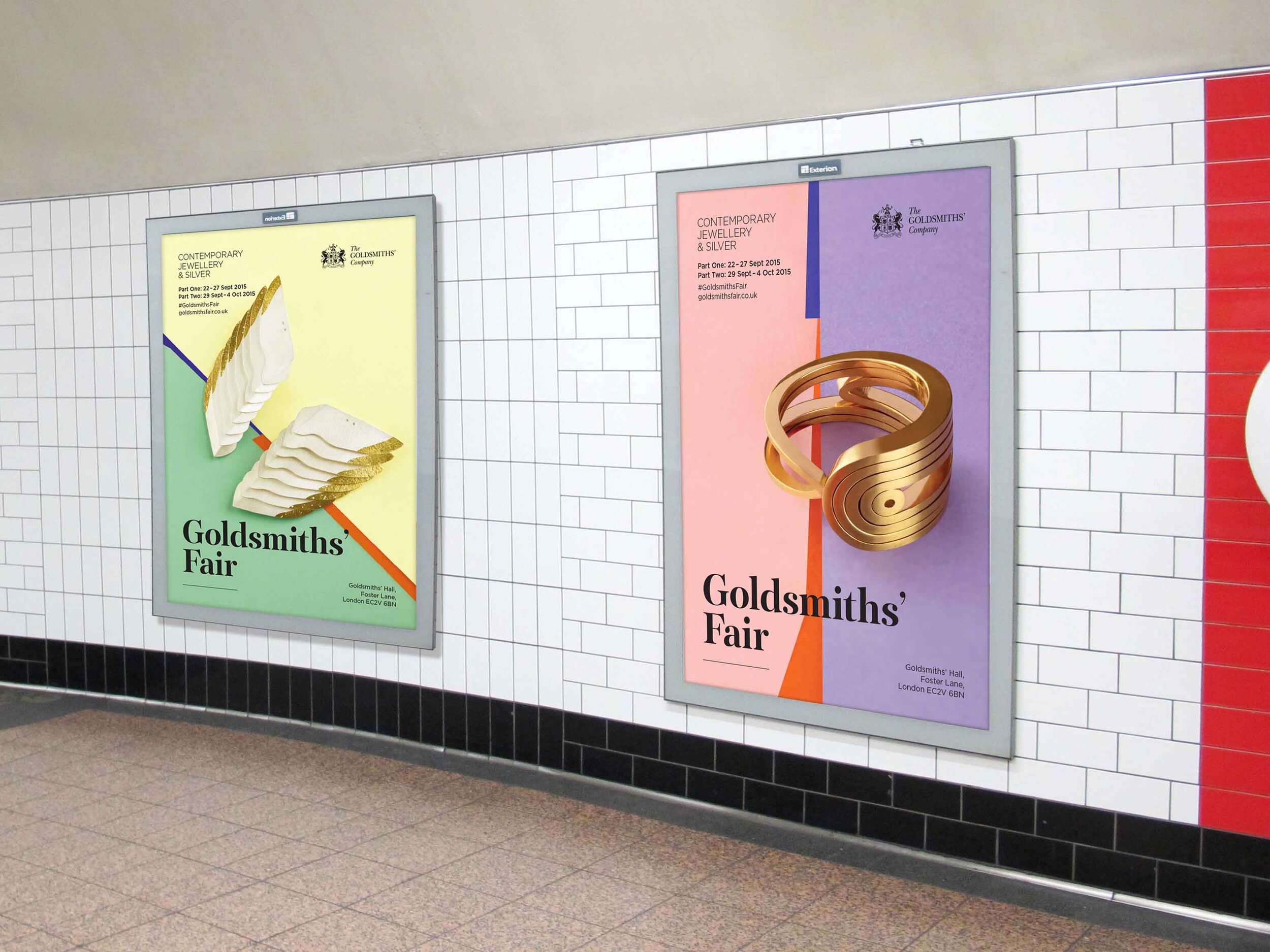
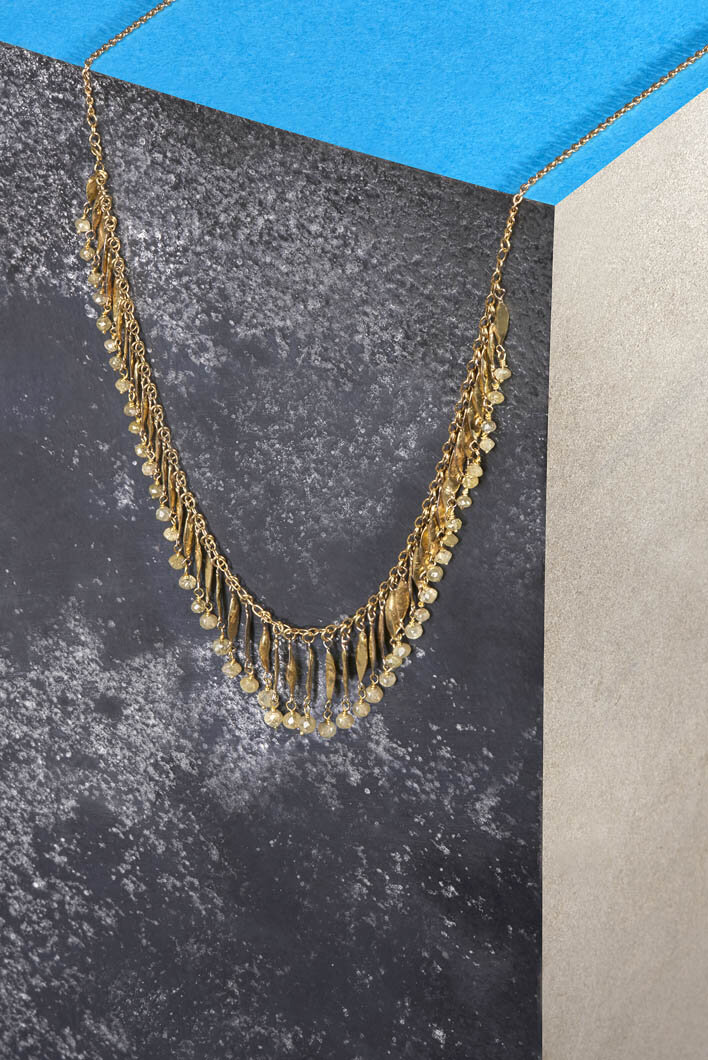
We worked with photographer Emma Todd to create a set of highly stylised images showing the jewellery in an abstract way. We refreshed the typography and carefully selected papers and finishes for the print to reflect the luxury of the event.
After the success of the new look we were asked to work on the identity over the next two years. We developed the same strong graphic style, using cut paper and then slate, marble and granite to create a suite of three connected but differing identities.
What we did
Brand identity
Art direction
Press advertising
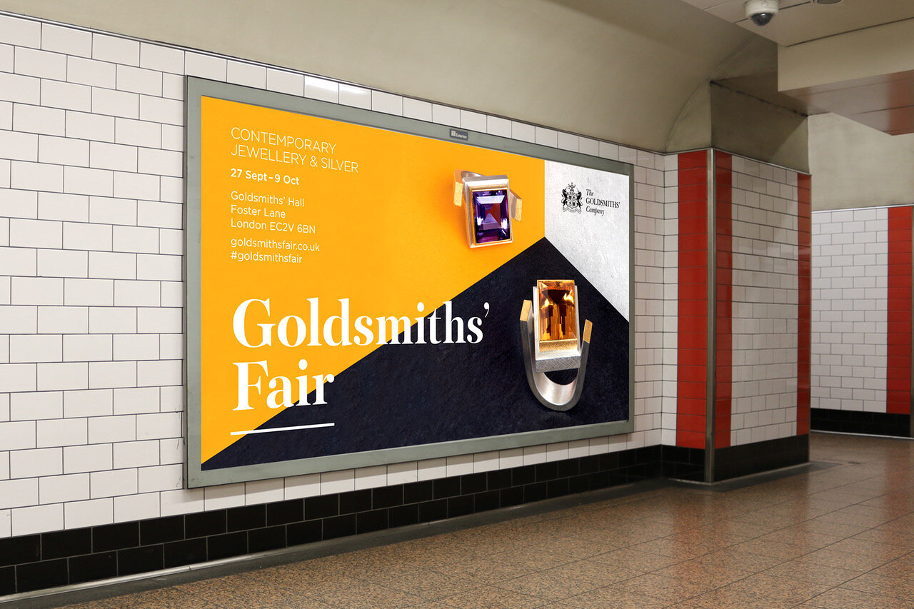
Rail and digital advertising
Exhibition design
Catalogues
Invitations
Leaflets
Signage and way-finding
“All the feedback we’ve received about the new brand look of the Fair has been overwhelmingly positive. It’s fresh, sharp and compelling. We’ve had a flood of new – and younger – clientele at this years Fair and I am convinced the new look is responsible. I know for certain that exhibitors have been happy to send out the flyers and invitations to their clientele and are thrilled to be associated with such a chic-looking event”
– David Mills, Director of Communications and Marketing


